Sherbrooke Collection
Context
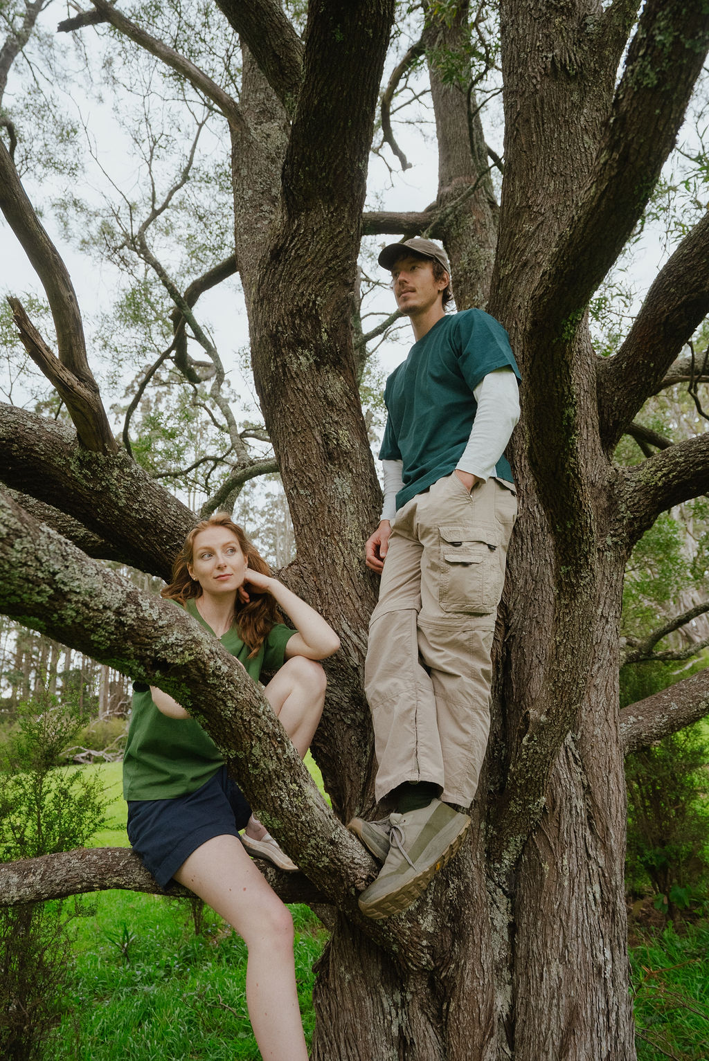
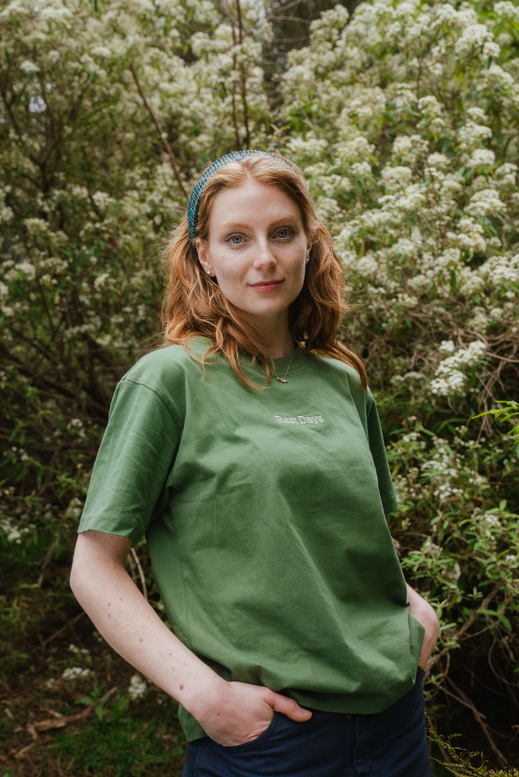
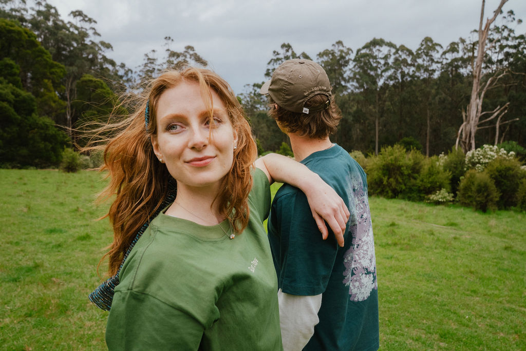
Rest Days is an independent clothing brand built around small, place-led drops and low-impact production. The ethos is about giving yourself time and permission to rest and reset away from constant digital noise, with a focus on time outdoors. Rest is framed as flexible and personal: active, social, solo or slow. The brand system extends across garments, packaging, e-commerce and content.
Challenge
While Rest Days is still an emerging brand, the website began to feel tired and clunky after the first drop. Drawing on natural landscapes and referencing late 70s–80s outdoor brand typography and print media, the aim was to create a site that feels fresh with each release. It prioritises smooth functionality and high-impact visuals that set the tone for each collection.
Solution
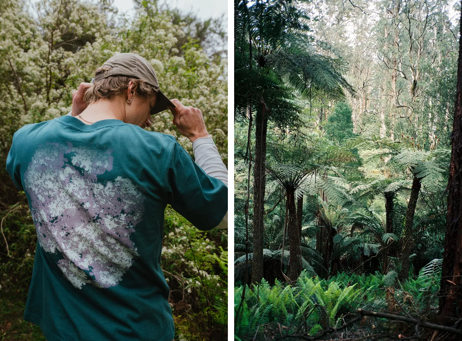
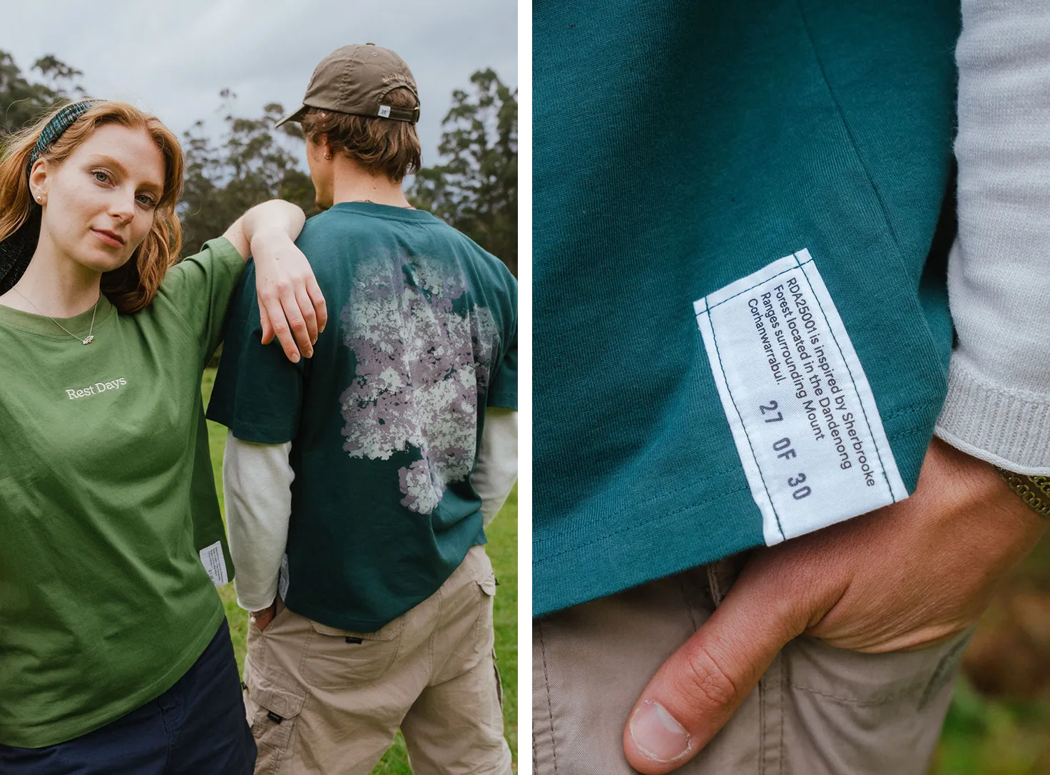
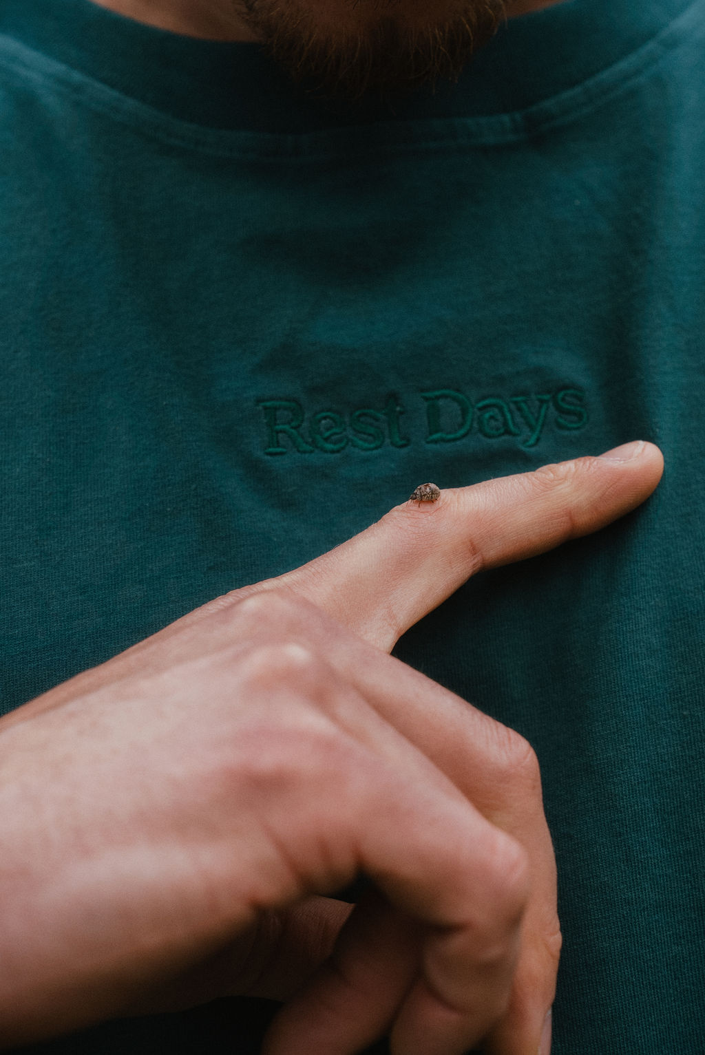
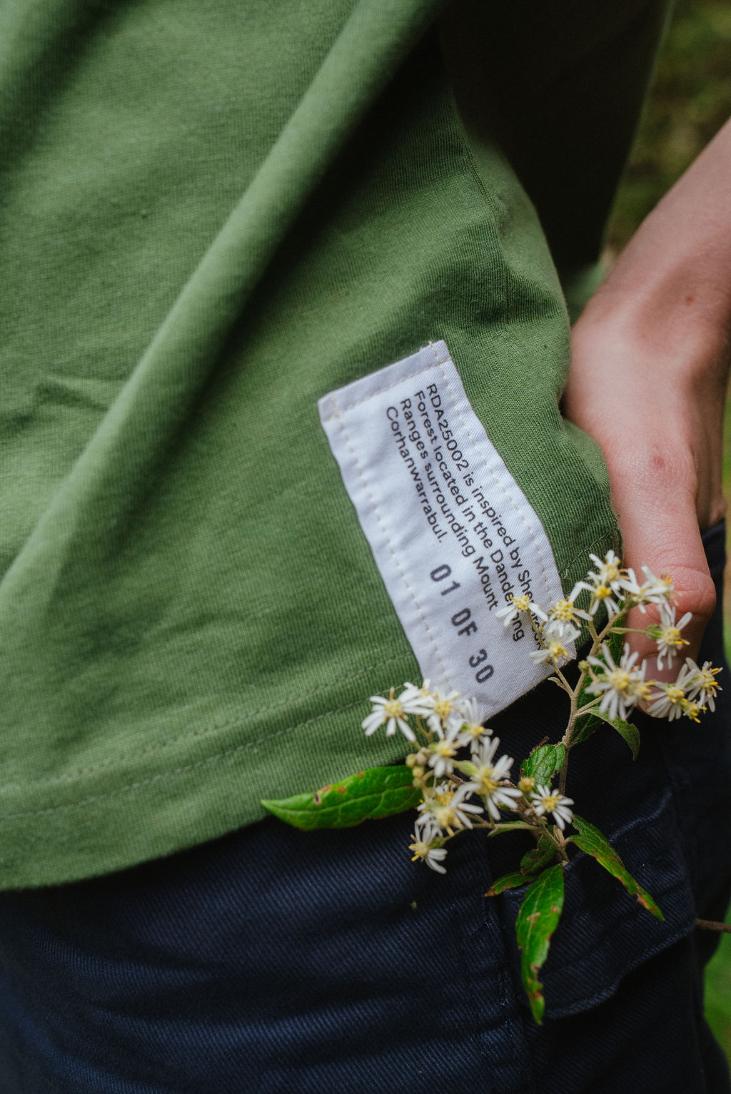
Unlike the previous collection, this series of 3 garments embraced hand-dipped plant dye, working closely with Indonesia's oldest dye houses. The Moss Tee and Field camp petina over time as plant-dy, giving each garment a unique quality depending on how much wear and tear the garment goes through. Graphic tee visuals were supported by textures photographed, scanned and collected on site, being screenprinted with water-based inks for a breathable fit.
The refined identity system across digital and print platforms utilises "VC Henrietta" as its primary typeface, chosen for its organic and rounded typeforms, semi-circular tittles and 70's nostalgia that merges well with visuals that prioritise the slow outdoors and natural landscapes over fast-paced content.
Photography and Cinematography: Marcus Read