Aco Sans
Context
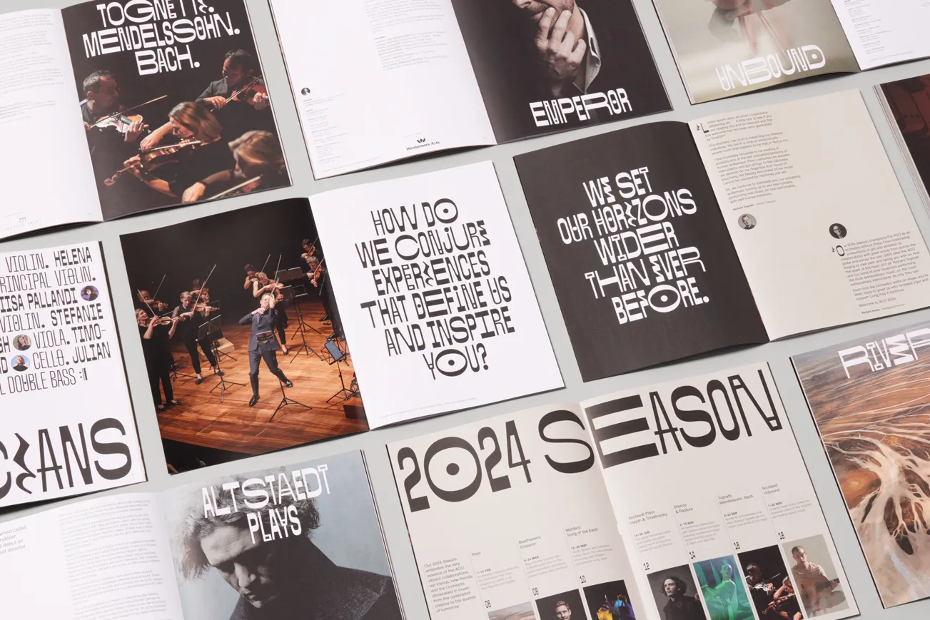
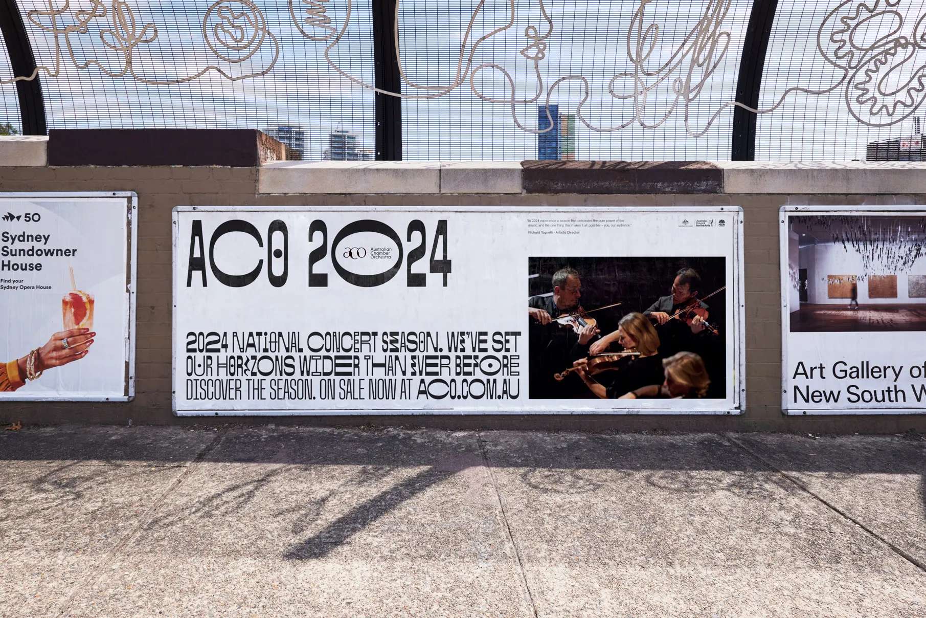
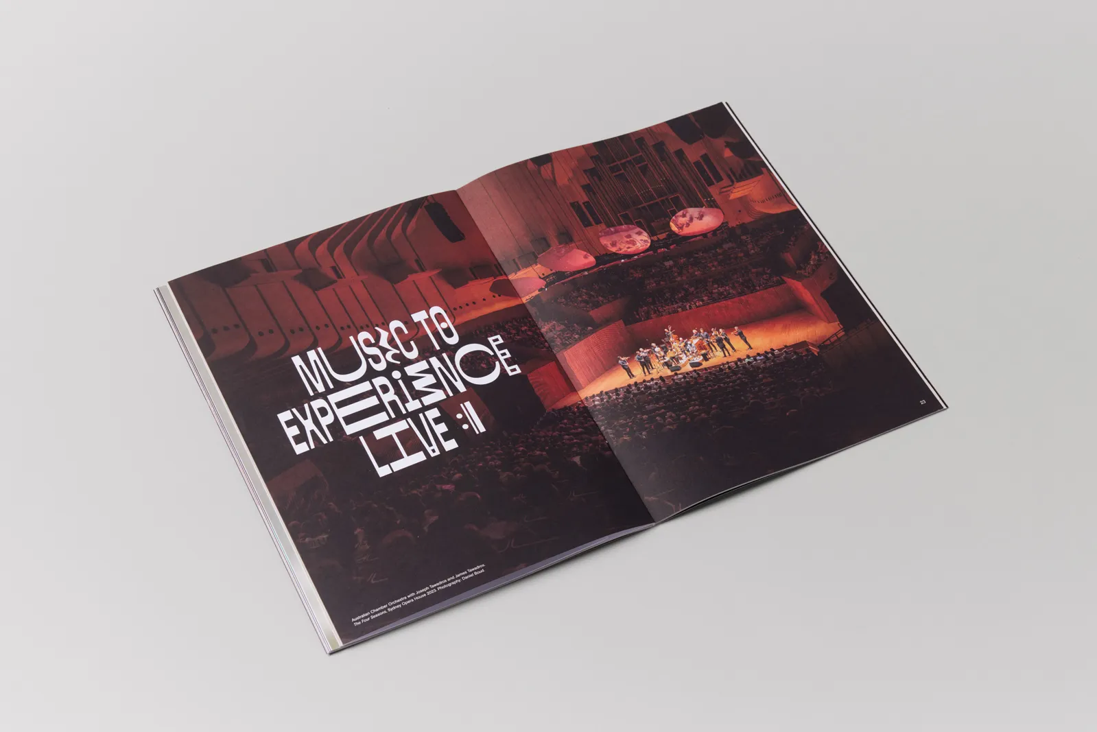
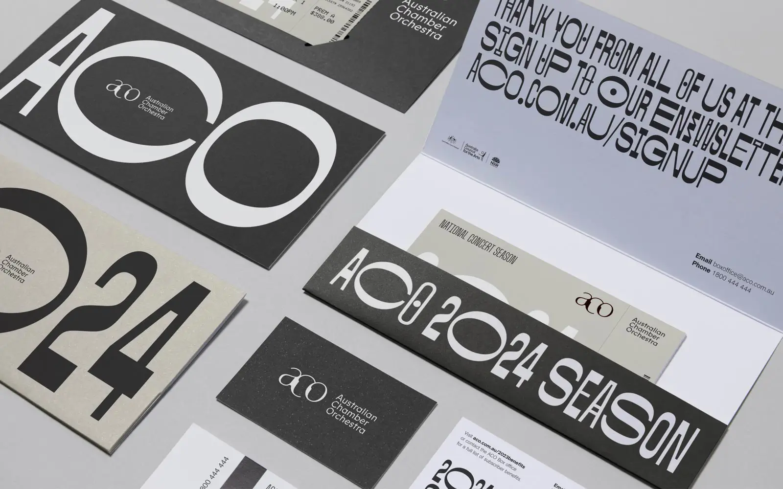
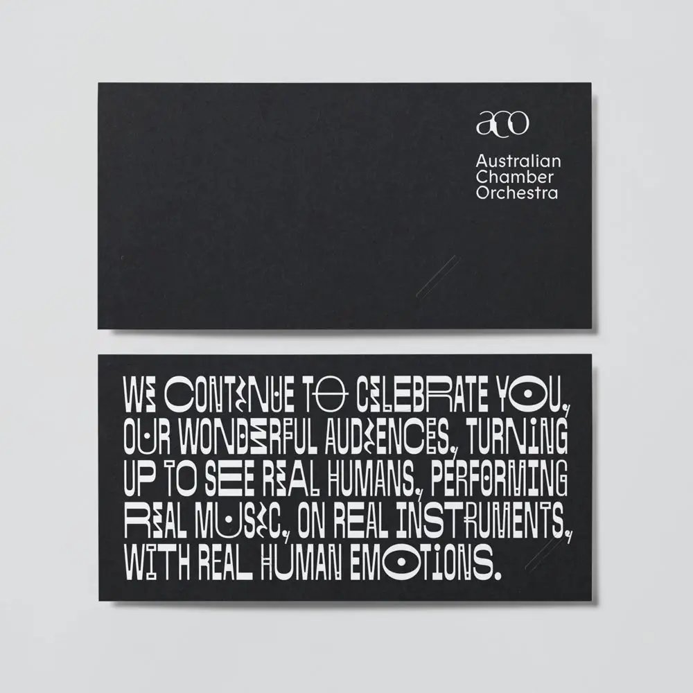
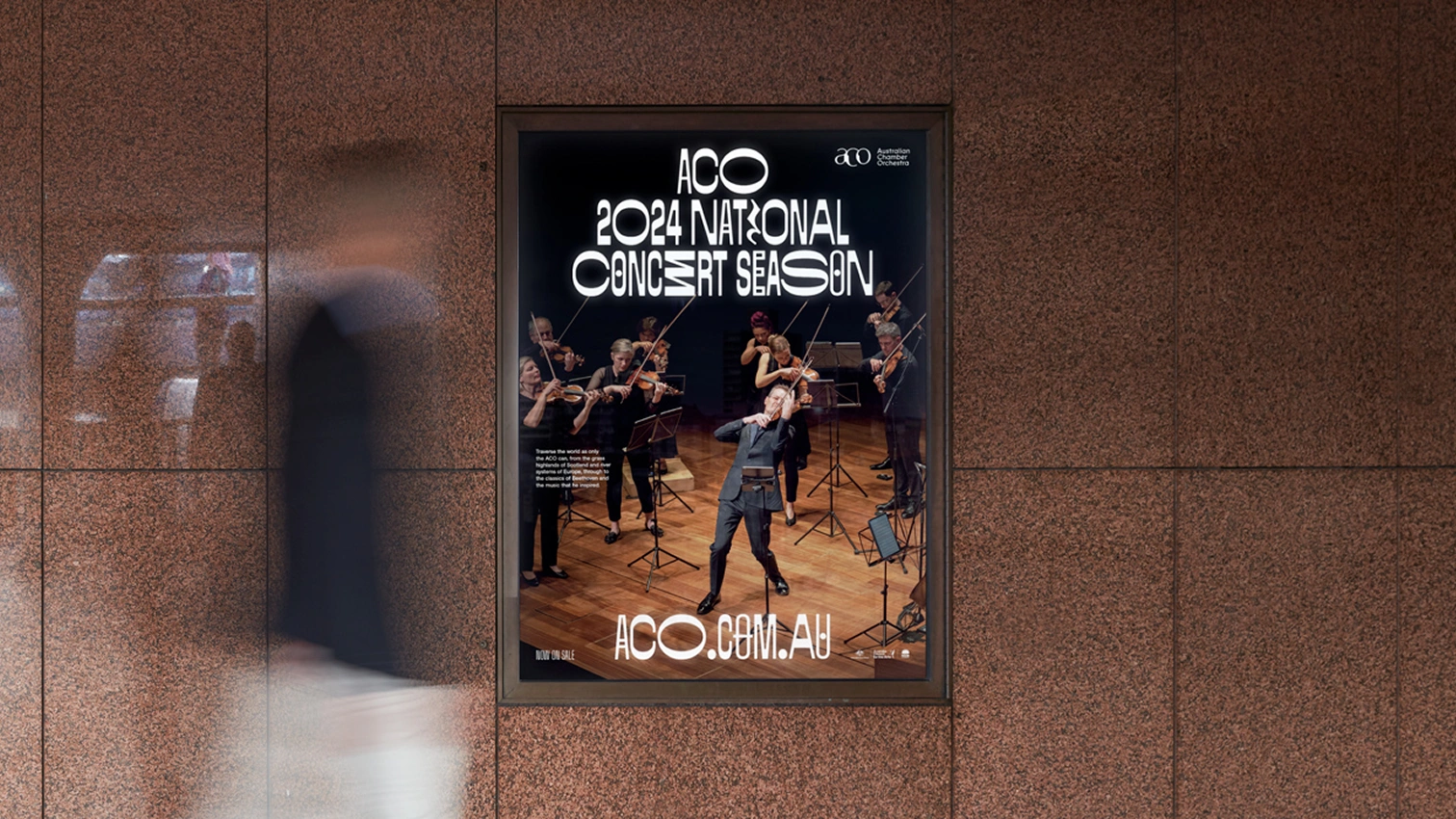
ACO Sans is a custom all-caps typeface created for the Australian Chamber Orchestra’s 2024 season campaign. Designed with the teams at Moffitt Moffitt and Matter of Sorts, it sat at the centre of a new direction that moved away from the photography-led seasons before it.
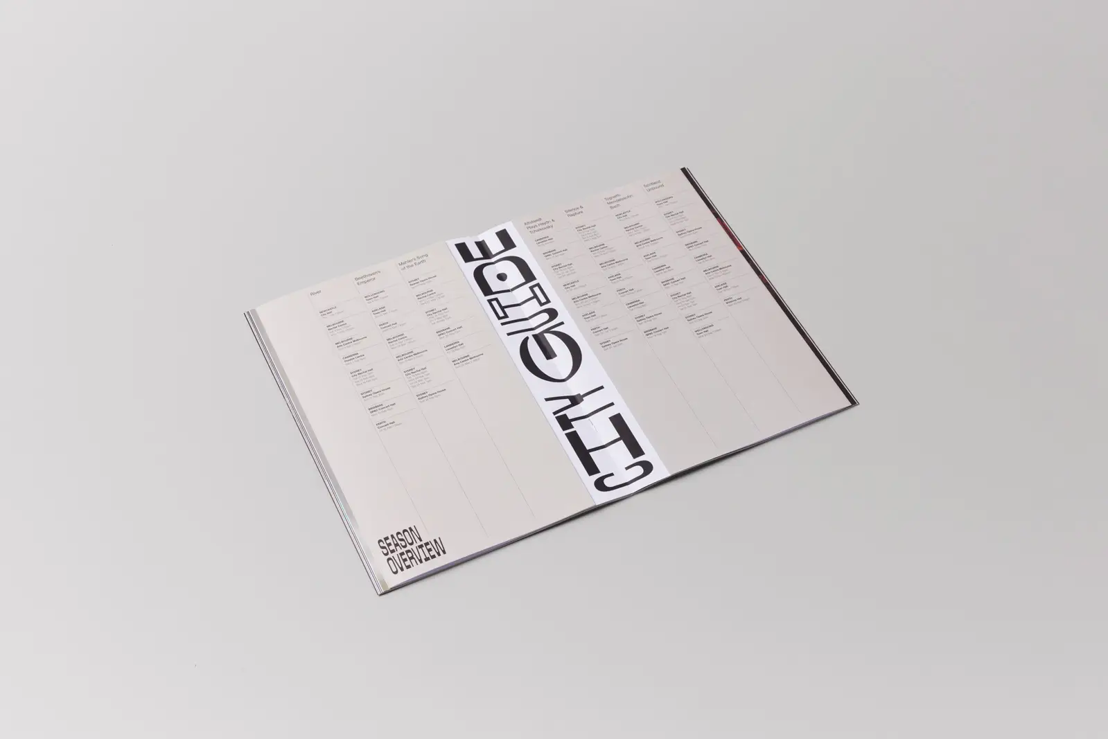
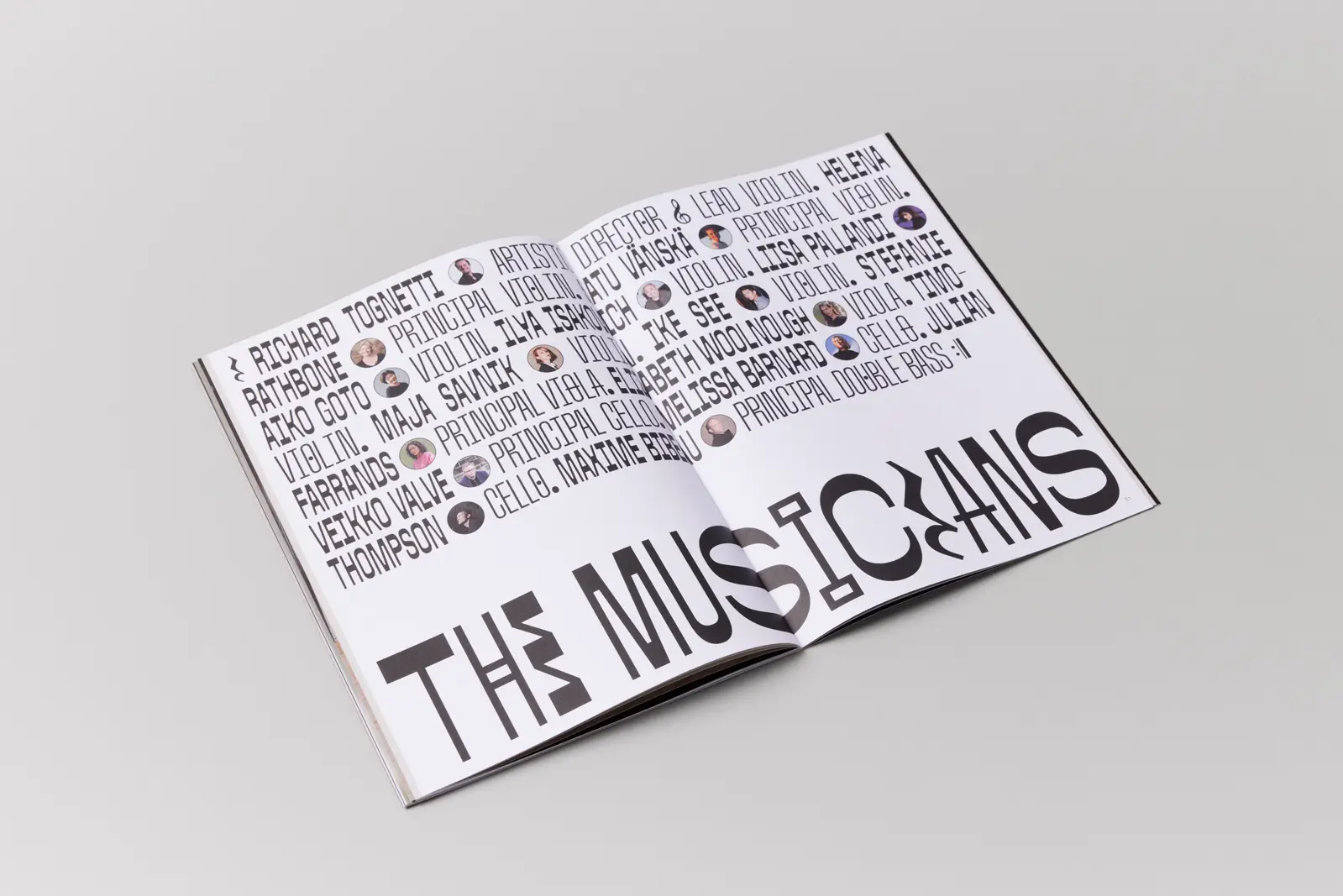
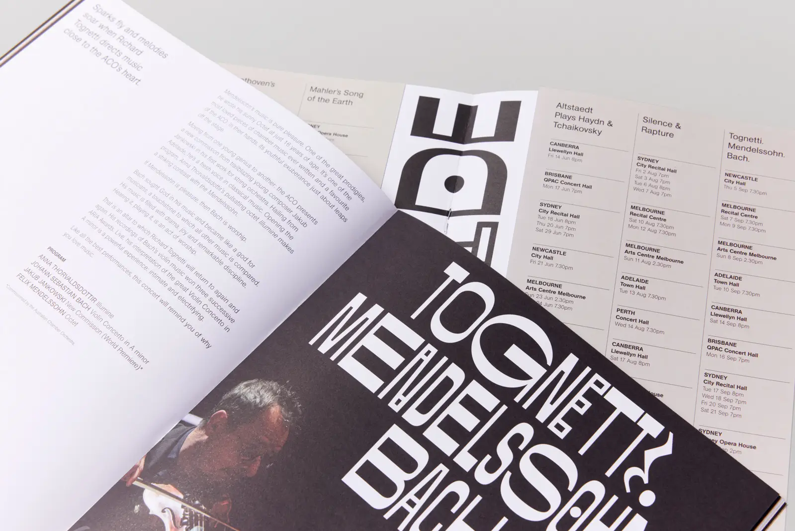
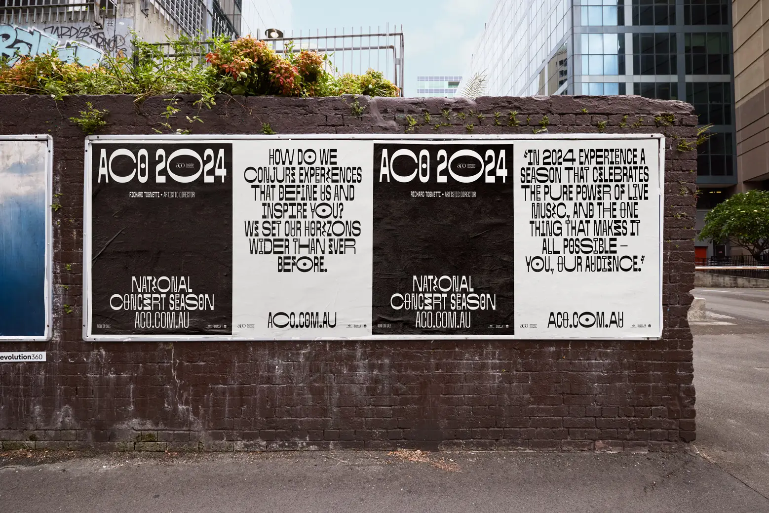
The brief was to reference musical notation without feeling themed. Reverse contrast became the anchor, drawing from the weight distribution of noteheads and stems. The typeface includes 1482 glyphs across four widths, multiple weights and up to seven alternates per character, supported by symbols taken from musical scores.
Challenge
The ACO needed a season identity that felt new but still carried the clarity and refinement the orchestra is known for. Without photography setting the tone, the typography had to do that work.
The challenge was to design a typeface that could hold the campaign on its own, feel expressive but not decorative and work consistently across print, digital layouts and large-scale applications.
Solution
We built the typeface around four widths tied to note durations: semibreve, minim, crotchet and quaver. Reverse contrast put more weight on horizontal strokes, echoing the structure of notation.
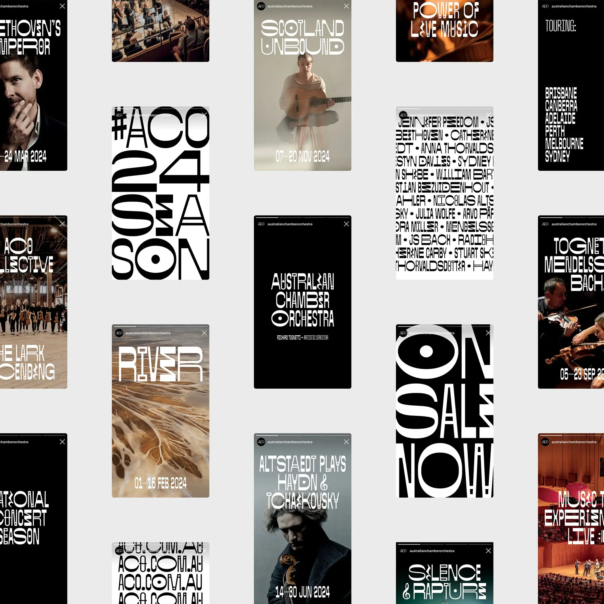
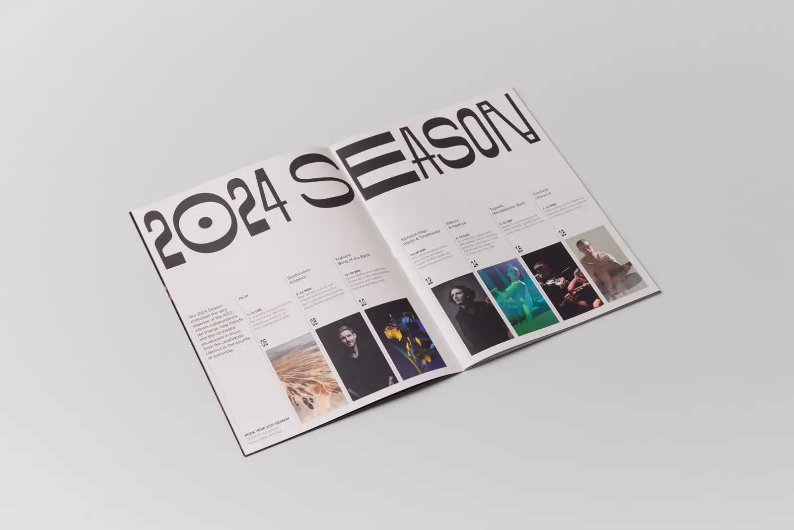
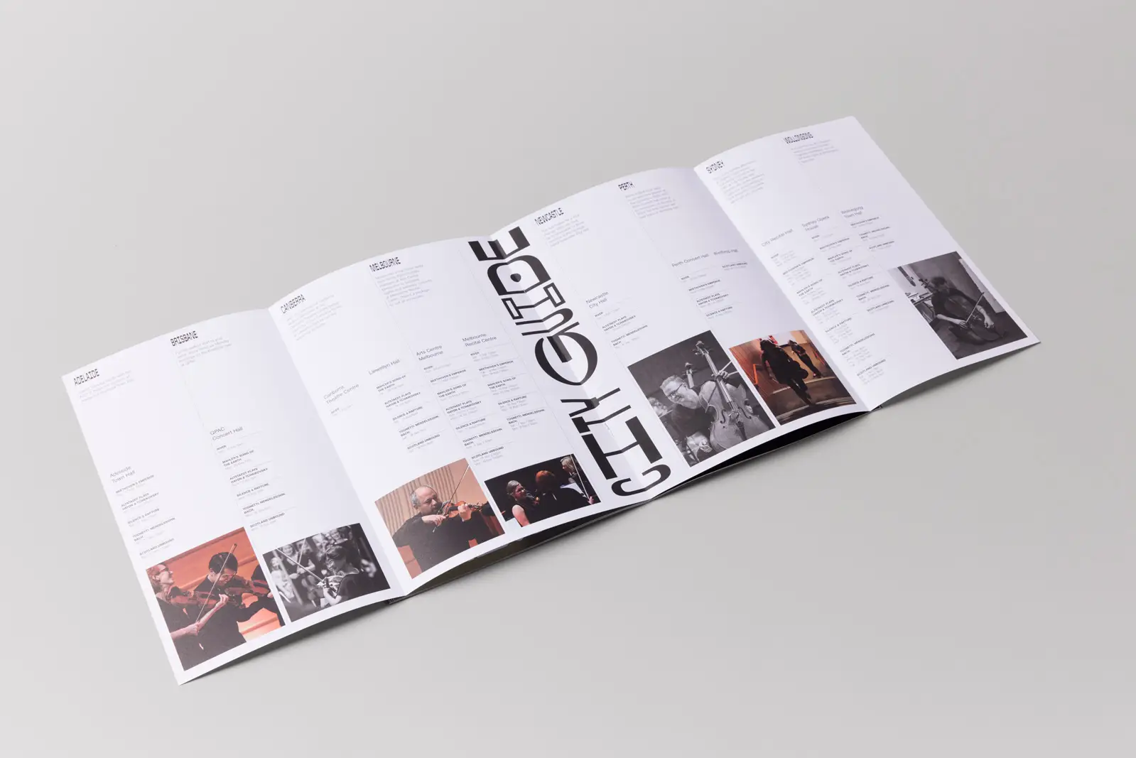
Working with the creative team, we developed a set of alternates and weights that allowed the typography to shift between headlines, titles and more atmospheric layouts. The final system is flexible, functional and connected to musical movement. ACO Sans was the central visual element of the 2024 season across all print and digital media designed by the team at Moffitt Moffitt.
Creative Direction & Documentation: Moffitt. Moffitt.
Type Lead: Vincent Chan